May 1, 2026
Create a professional custom golf course map for your next tournament. Our guide covers design, printing, and digital integration with tools like Live Tourney.

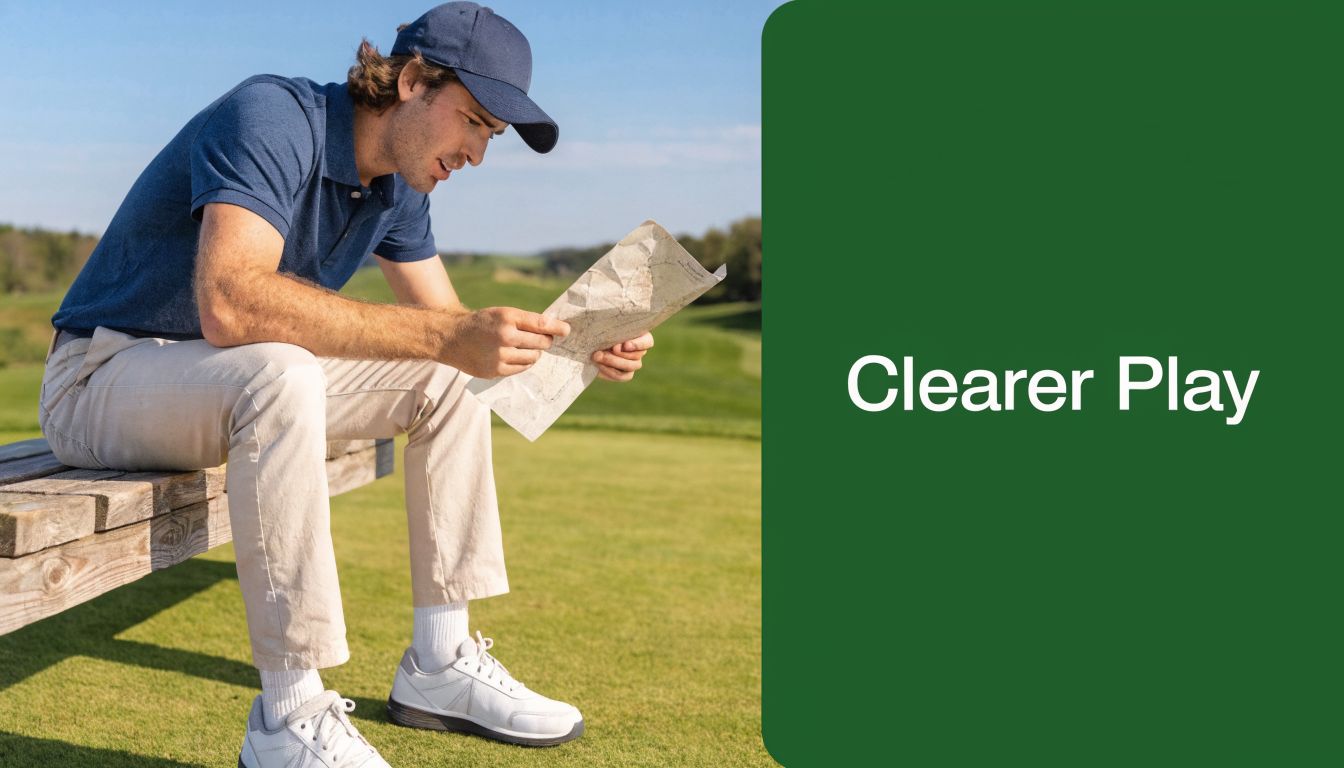
Players can tell within a minute whether an event is organized or improvised. One of the fastest giveaways is the map. If check-in packets include a washed-out photocopy with old bunker lines, missing drop zones, and sponsor logos crammed into the margins, the day starts with friction. Staff answer the same directional questions all morning. Guests miss the details that matter. The event feels smaller than it should.
A custom golf course map fixes more than appearance. In tournament operations, it works as a communication tool, a branding asset, and a practical reference that helps people move through the day with less confusion. The best ones don't just show holes. They support pairings, signage, scorecards, pace-of-play reminders, sponsor placements, and digital distribution.
Most of the market still treats custom maps as home decor first. That's fine if you're selling framed prints. It doesn't help much if you're running a charity outing, member-guest, junior series, or multi-round club event and need a map people can use effectively under pressure.
Beyond Wall Art Why Your Tournament Needs a Custom Map
Decorative course prints have their place. They're great in a clubhouse, pro shop, office, or trophy room. But tournament maps have a different job. They need to answer questions before players ask them.
A functional tournament map should help players do four things quickly:
Understand the hole without hunting for tiny labels
Handle event logistics such as check-in, range access, restrooms, food stations, and awards flow
Recognize tournament rules including local drops, cart path restrictions, or shotgun assignments
See sponsor placements in a way that feels intentional instead of slapped on at the end
That matters because existing content on custom golf course maps leans heavily toward decorative wall art, while a major gap remains for organizers who need interactive, digital maps for event management. That gap is especially relevant for outings and leagues where digital maps can visualize formats and improve engagement, including the 40% boost tied to live scoring adoption noted in this market discussion on custom golf maps for event use.
Why standard course maps fail during events
A stock scorecard map usually isn't built for tournament traffic. It's often too small, too generic, and too static. It won't reflect temporary event elements like sponsor tents, contest holes, welcome stations, shuttle loops, or adjusted teeing areas.
It also assumes local knowledge. Your regular members may know where the comfort station sits between holes. First-time charity players usually don't.
Practical rule: If your staff answers the same location question more than a few times on event day, the map didn't do enough work.
What a tournament map changes
The best tournament maps reduce decisions. Players see where to go. Volunteers know what to hand out. Sponsors get cleaner visibility. Registration tables look more polished because every printed piece belongs to the same visual system.
A useful map also sets expectations. It tells players, "This event is thought through." That affects the mood of the day more than most organizers realize.
For serious operations, don't think of the map as an extra. Think of it as one of the small tools that keeps the rest of the event from feeling patched together.
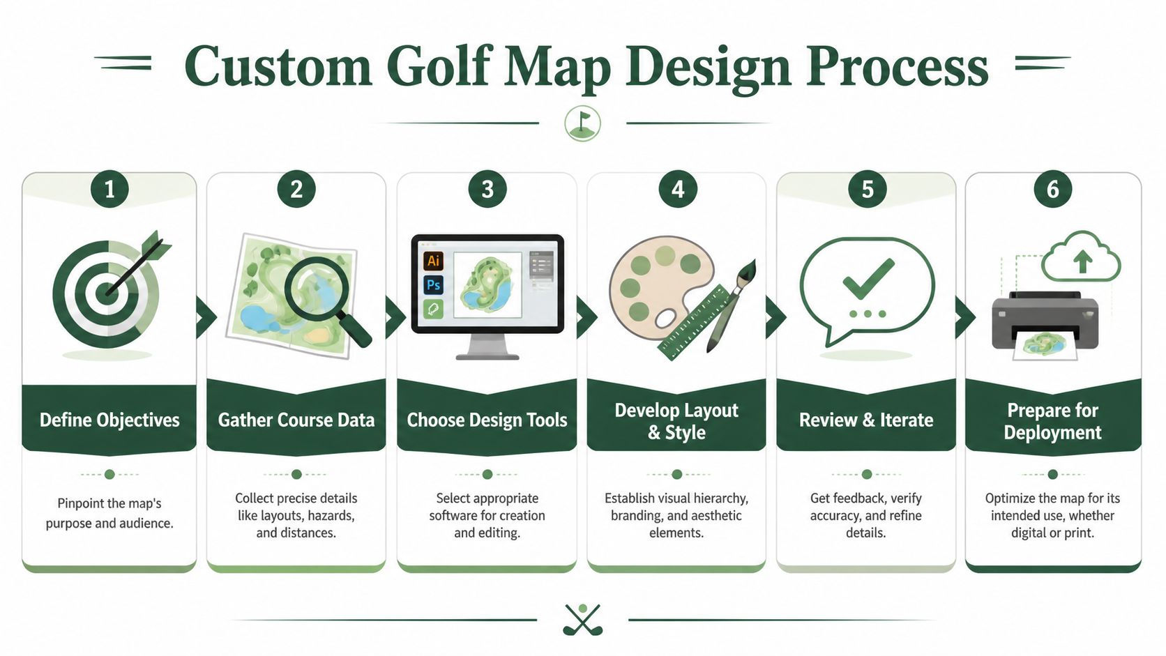
Strategic Planning for Your Course Map
Most bad maps aren't design failures. They're planning failures. Someone starts drawing before deciding what the map needs to accomplish.
The planning phase is where you make the important calls. Is the map primarily for navigation, sponsorship, hole strategy, or event logistics? Is it going in a player packet, on a cart sign, in a pre-event email, or all three? The answers change the layout.
Start with the event goal
A member-member map should look different from a charity scramble map. So should a junior event map, a state association qualifier, or a corporate outing with a heavy sponsor load.
I sort the purpose into one dominant role and one supporting role:
Primary role
This is the job the map must do well. Maybe it guides guests around an unfamiliar property. Maybe it supports a complex shotgun start. Maybe it helps players understand risk-reward holes.Secondary role
The secondary role allows you to add value without weakening the main function. Common examples are sponsor recognition, pace reminders, or branding consistency across tournament materials.
When organizers skip this step, they try to make one map do everything. That usually produces clutter.
Define the audience before the layout
A custom golf course map for scratch players can assume more golf literacy than a map for a charity field. That changes labeling, icon use, and how much strategic detail belongs on the page.
Use a simple audience split:
First-time or infrequent golfers need strong wayfinding, clear landmarks, and plain language
Club players usually want cleaner strategy notes and less hand-holding
Sponsors and guests benefit from visible hospitality locations and event touchpoints
Staff and volunteers need a version that prioritizes operations, not aesthetics
If you're planning a larger event calendar or evaluating where golf demand and facility concentration support growth, tools like NGF's GolfMAP provide planning context, including 25 million U.S. on-course participants in recent years and more than 16,000 U.S. facilities verified annually through NGF GolfMAP market data. That kind of data is useful at the facility level when deciding how much effort to invest in repeatable event assets instead of one-off handouts.
Gather the information that actually matters
Course teams often over-collect and under-prioritize. The goal isn't to dump every available detail onto the map. It's to gather the information that changes player behavior or reduces confusion.
Here's the shortlist I use:
Playing information such as tee locations, yardages, hazard edges, forced carries, out-of-bounds lines, and drop zones
Operational details like cart staging, registration flow, range location, practice green, restrooms, and food or beverage stops
Tournament specifics including contest holes, sponsor activations, pace checkpoints, crossing points, and any temporary routing notes
Brand elements such as event name, date, host logo, and sponsor tiers
If a detail doesn't help someone make a better decision on tournament day, it probably belongs somewhere else.
Build one master version, then create derivatives
Many teams achieve significant time savings by streamlining their map creation process. Don't design separate maps from scratch for the packet, cart sign, leaderboard screen, and email attachment. Build one master source file, then create lighter versions for each use case.
That discipline also helps when the superintendent moves a teeing area or a sponsor changes. You edit once, not five times.
For broader event preparation, a practical companion is this golf tournament planning guide. It fits well with the map-first mindset because a lot of tournament friction starts long before the first tee shot.
Designing for Clarity and Impact
A tournament map has a short job window. Players glance at it on the range, in the cart, or while waiting on the first tee. If they cannot spot the hole shape, main trouble, and event markers in a few seconds, the map is decoration, not an operations tool.
Match the design method to how the map will be used
Start with the end use, not the software.
A one-off charity scramble handout can be built in Canva or a similar layout tool if the base course image is clean and the edits are simple. A recurring member-guest, college event, or multi-day corporate outing usually needs more control. That is where GIS-based mapping earns its keep. It handles layers, routing changes, hazard outlines, sponsor overlays, and version control much better than a general design app.
That trade-off matters. Quick tools are faster for branding and simple handouts. Precise tools are better when the map also feeds cart signs, digital leaderboards, mobile PDFs, starter sheets, and event staff references from the same source file.
Build a hierarchy that works at a glance
Players do not read a tournament map in order. They scan for answers.
Set the visual hierarchy so the course comes first, the decision points come second, and the event overlay comes third. If a nearest-to-the-pin badge or sponsor logo grabs more attention than the forced carry or drop zone, the map is out of balance.
A practical hierarchy looks like this:
Hole shape and boundaries
Fairway edges, greens, tee boxes, water, bunkers, out-of-bounds, and major tree masses should be easy to read right away.Play-driving labels
Yardages, layup lines, forced carries, landing areas, and drop zones come next.Tournament operations
Cart restrictions, crossing points, shuttle stops, hospitality tents, scoring stations, and contest-hole markers should be visible without crowding the hole.Branding and sponsorship
Event identity should frame the map, not interrupt it.
One accent color is usually enough for tournament-specific information. Use it consistently so players learn the code fast.
Design for sun, motion, and rushed decisions
Maps fail in the field for predictable reasons. Fonts are too small. Contrast is too soft. Labels sit on top of busy textures. Fine details disappear once the page is folded or viewed from a cart seat.
Test the map under tournament conditions, not just on a monitor. Print it at final size. Put it on a cart dashboard. Hand it to someone who has not seen the course. Ask them to find the carry on a risk-reward par 4, the nearest restroom, and the contest hole. If that takes more than a few seconds, revise the design.
Readable maps usually share the same traits:
Strong contrast between turf, hazards, and labels
Short labels with consistent abbreviations
Icons used sparingly and repeated consistently
Clear line weights for boundaries, cart paths, and temporary routing
Enough white space around operational notes
That same discipline improves every other player-facing document. The same mistakes that clutter maps also confuse setup materials. This guide on how to read pin sheets is useful for the same reason. Good information design depends on hierarchy, not volume.
Cut detail that does not help a tournament decision
Removing detail usually improves the map faster than adding design polish.
Tree texture is a common offender. Show tree masses that define strategy, block sightlines, or affect a landing area. Skip decorative tree-by-tree rendering if it makes labels harder to read. Contours are similar. Unless the event format calls for precise green and landing information, too much surface detail creates visual friction.
Use a simple filter:
Include it | Leave it off |
|---|---|
Hazards that change club or target | Decorative texture with no tactical value |
Temporary event stations | Labels players already know from signage |
Crossing points and drop zones | Minor maintenance paths |
Cart restrictions and one-way routing | Dense ornamental background detail |
Use realistic rendering only when it serves operations
High-fidelity rendering can look excellent, especially on sponsor boards, welcome displays, and digital screens. It also takes more time to build and more discipline to keep readable.
Esri shows one strong example in its golf course mapping method, using layered fills and line symbols to create more realistic turf textures. I use that approach selectively. It works well when the map needs to carry a premium visual standard across print and screen. For a folded player handout, simpler symbology is often the better choice because it survives glare, scaling, and quick scanning.
The same judgment call applies outside tournament maps. Surface detail can improve the presentation, but only if it still supports function. That is also true in smaller installations such as practice areas and home greens, where material choice affects performance more than appearance. A practical reference is this guide to backyard putting green turf options.
Place sponsors where they get seen without blocking the course
Sponsors should be visible and easy to recognize. They should not sit on top of yardages, hazards, or directional notes.
The cleanest placements are usually a footer band, a side panel on larger boards, or a keyed list tied to hole numbers. If a sponsor owns a contest hole or hospitality area, a small, consistent marker on that location works well. Scattering logos across the map weakens both usability and sponsor recall.
A strong tournament map looks polished because it is organized. More important, it helps players and staff make the right decisions quickly.
From Digital File to Physical Print
A custom golf course map can look excellent on screen and still print poorly. That's usually a file-prep problem, not a printer problem. Tournament teams often hand off a low-resolution image, the wrong color mode, or a layout that was never built for final size.
The first decision is whether the artwork should stay vector or raster. Vector files are made from shapes and paths, so they scale cleanly. That's what you want for linework, labels, icons, and sponsor marks. Raster files are pixel-based, which is fine for satellite textures or photographic backgrounds, but they can soften quickly when enlarged.
Use file formats that match the output
If the map may end up on a cart sign, welcome board, sponsor board, and a folded handout, keep a master vector version. PDF is usually the safest handoff format because printers can open it reliably, and it preserves layout better than a loose image export. If your designer is working natively in Adobe Illustrator, keeping AI or EPS source files is helpful for revisions.
For specialty production, precision matters even more. In CNC-based map production, the layout is digitized in software such as Vectric Aspire, then engraved with a 60° V-bit, a method described in this golf course print production workflow. That kind of process highlights the same lesson tournament directors learn with print: the cleaner the source file, the closer the final piece stays to the intended design.
Design for print, not just for monitors
A lot of event materials are designed in RGB because screens make everything look vibrant. Printers work differently. If the map is headed to paper, discuss CMYK output with your print partner early so your greens, blues, and sponsor colors don't drift.
Paper choice matters too. Gloss can make colors pop, but it also reflects sunlight and fingerprints. Matte stocks are often easier to read on carts and at registration. For outdoor signage, synthetic and water-resistant materials usually hold up better than ordinary paper.
Here's a quick production guide.
Asset Type | Recommended Paper/Material | Ideal Finish | Key Consideration |
|---|---|---|---|
Player handout map | Heavier text stock or light cardstock | Matte | Easier to fold and read in sunlight |
Cart sign map | Weather-resistant synthetic stock | Matte or low-glare | Holds up better to dew, drinks, and handling |
Welcome board insert | Mounted board print | Low-glare | Prioritize readability from a distance |
Premium keepsake map | Thick cardstock or wood-based specialty substrate | Depends on product | More about presentation than rapid readability |
Match the material to the moment
Tournament directors sometimes overspend on the wrong asset. A premium finish makes sense for a framed commemorative piece or sponsor gift. It usually doesn't make sense for a disposable shotgun handout.
This is the trade-off I use:
Short-life assets should optimize cost, speed, and readability
Mid-life assets like reusable signage should prioritize durability
Long-life assets such as display pieces can justify richer materials and more elaborate production
That same thinking shows up in course-side projects too. If you're planning a branded practice area or hospitality activation and want a clearer sense of surface choices, this overview of backyard putting green turf options is useful because it explains how material decisions affect performance and appearance over time.
Talk to printers like an operator
A productive printer conversation is simple if you bring the right information:
Final size of each asset
Environment where it'll be used, such as indoors, cart-mounted, or exposed to moisture
Quantity and turnaround
Whether the file includes bleed and trim
Whether you expect future reprints with only date or sponsor swaps
Printers can solve a lot of problems. They can't rescue a file that was never built for its final use.
If you treat print as the last operational step instead of an afterthought, the map will feel more professional in the player's hand, not just in the design proof.
For organizers who pair maps with printed scoring materials, it's also worth reviewing what makes a strong golf scorecard. In practice, the scorecard and the map work best when they're designed as companion pieces rather than separate jobs.
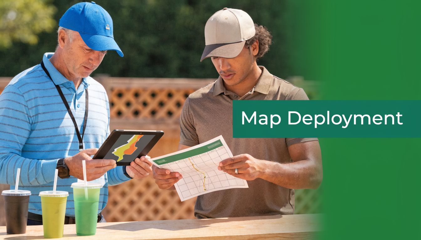
Deploying Your Map for Maximum Tournament Impact
The first real test of a custom golf course map happens ten minutes before the shotgun start. A guest asks where the nearest restroom is from hole 6. A sponsor group wants to know the quickest route back to the hospitality tent. Two players are staring at the scorecard, trying to figure out whether the long-drive hole is 9 or 18. If the map only exists as a nice printed insert, staff ends up answering the same questions all morning.
A tournament map should work like an operating tool. It needs to show up where decisions happen, and it needs to connect to the systems players already use before, during, and after the round.
Put the map where players actually need it
Good placement cuts questions. Bad placement creates a pretty asset nobody uses.
The strongest distribution plan usually includes several versions, each built for a specific job:
Check-in table for first orientation, course flow, and event highlights
Cart signs for hole-by-hole reference during play
Starter area for local rules, pace notes, and routing reminders
Practice area signage so groups understand where to warm up and where to report
Post-round venue if the map also supports sponsor recognition, auction items, or awards context
The key trade-off is density versus speed. A registration board can carry more detail because players have time to read it. A cart placard needs fast scanning and larger labels. Trying to force one design into every format usually weakens all of them.
Digital delivery covers the moments print misses
Printed maps disappear. They get left in carts, folded into bags, or handed to one player in a foursome who never shares it.
Digital access fixes that. Send the map before the event, load it into the player portal, and make sure staff can pull it up quickly on-site. Course data providers such as iGolf's golf course mapping platform have made digital map deployment practical for event operations, especially when a tournament needs mobile-ready files, hole references, or software-friendly course layouts.
That matters most for events with guests, corporate groups, and charity participants who do not know the property. If they can zoom in on the route to a contest hole or confirm where the nearest comfort station sits, your staff spends less time giving directions.
Build screen-specific versions
One file should not do every job.
Print layouts often fail on phones because labels shrink, legends take over the screen, and players have to zoom around while standing on a tee. Prepare separate exports for the channels you use:
Use case | Best version |
|---|---|
Pre-event email | Clean PDF for desktop viewing and download |
Phone on course | Vertical mobile-friendly image or simplified PDF |
Cart tablet or event display | Wide-format version with stronger labels and fewer fine details |
Registration monitor | Large overview focused on logistics, contest holes, and key landmarks |
Software integration becomes critical. If your event app, live scoring page, or registration platform can host a mobile-safe map file, use that version instead of dumping in the print proof and hoping players make it work.
Tie the map into tournament operations
The best custom golf course maps do more than show holes. They support the event system.
Use the same hole names, icons, and color cues across pairings, cart sheets, rules pages, and scoring materials. If hole 14 is your closest-to-the-pin hole on the map, it should be labeled the same way everywhere else. If hospitality tents, shuttle stops, and sponsor activations appear on the course layout, those labels should match your event communications exactly.
Useful integration points include:
Pairings and starting assignments
Scorecards and cart materials
Pre-event texts or email reminders
Rules sheets and hole notes
Live scoring portals or tournament microsites
I have seen this save a lot of avoidable staff time. Players stop asking where to go next. Volunteers stop improvising directions. Late arrivals can catch up without interrupting registration.
That is the true return. A custom golf course map should improve flow, reduce repeated questions, and make the tournament feel organized from the first check-in moment through the awards presentation.
Pro Tips for Flawless Map Execution
The common assumption is that the big win comes from better design software. It doesn't. The big win comes from better verification.
Even now, one of the weak spots in the custom golf course map market is accuracy for local and lesser-known courses. Players regularly call out 10 to 20 yard discrepancies on maps for everyday tracks, which is why tournament directors should verify against official sources or GPS-based overlays, as noted in this discussion of accuracy issues on non-famous golf courses.
Walk the course before you approve the final
Satellite views and existing scorecards help, but they don't catch temporary changes, new tree work, rerouted paths, moved drop zones, or areas under maintenance. A short site walk with the superintendent or golf staff catches errors that players will spot immediately.
Bring a printed proof and mark it by hand. That review is usually faster than trading email comments on screenshots.
Design for older eyes and distracted players
A lot of tournament maps are technically correct and functionally hard to use. Small fonts, low-contrast colors, and thin hazard outlines may look refined at a desk. They fail on a moving cart.
Use these standards in practice:
Increase contrast between turf, hazards, and text
Simplify labels so players read them instantly
Avoid crowding the green complex with too many notes
Use icons consistently across every tournament piece
Don't try to make one map say everything
Clutter is usually a sign that the organizer never separated audiences. If players need one set of information and staff need another, create two versions. That isn't wasted effort. It's cleaner communication.
The fastest way to ruin a useful map is to keep adding "just one more thing."
Keep the branding disciplined
Brand consistency matters, but tournament branding should support usability. Use the same fonts, logo treatments, and color family across the map, scorecard, rules sheet, and signage. Then stop. Extra flourishes rarely make the event look more premium. They usually make it look crowded.
Accuracy and restraint are what make the final product feel professional.
Elevating the Player Experience with Smart Maps
A strong custom golf course map does something subtle but valuable. It lowers the mental load of the day. Players spend less time figuring out where to go, what applies on a hole, or where the event activity is happening. Staff spend less time repeating instructions. Sponsors appear in a cleaner, more deliberate way.
That's why the best tournament maps aren't decorative add-ons. They're operating tools with a presentation benefit. The planning has to be intentional. The design has to be legible. The print specs have to fit real-world use. And the deployment has to meet players where they look, both on paper and on their phones.
When those pieces line up, the event feels tighter. Check-in moves better. The course looks more prepared. Guests notice the difference, even if they can't name the reason.
If you want a simpler way to pair custom maps with scorecards, cart signs, pairings, live scoring, and player communications, Live Tourney is built for that kind of tournament workflow. It helps courses and organizers run polished events without making staff wrestle with clunky software or forcing players to download an app.