Jun 17, 2026
tournament logo, golf tournament branding, event logo design, golf event planning
Create a professional tournament logo that works everywhere. This guide covers design, sponsor placement, file formats, and use on scorecards, signs, and more.

You know the moment. The banner arrived, the scorecards are on the registration table, and the logo that looked fine on a laptop now looks muddy on print, crowded by sponsor marks, and almost unreadable on a phone. That's usually when organizers realize a tournament logo isn't decoration. It's equipment.
For a golf event, the logo has to survive real work. It has to read on a cart sign from a few feet away, hold together on a bag tag, sit cleanly on a registration page, and still look like the same event on awards signage. If it fails in any one of those places, the whole event feels less organized than it is.
Good tournament branding isn't about making something flashy. It's about making something usable. The strongest marks are simple enough to reproduce cleanly, distinct enough to remember, and flexible enough to share space with sponsor logos without losing their identity. That's what separates a professional event look from something that feels pieced together the week before tee time.
More Than a Mark Why Your Tournament Logo Matters
A tournament logo does three jobs at once. It identifies the event, signals quality, and keeps everything visually connected from registration through the final leaderboard. If the mark changes shape, color, or layout every time someone exports a file, players notice it even if they can't explain why.
That consistency has real value. Consistent logo use across platforms is linked to a 23% revenue increase, according to logo consistency and recognition statistics from Huddle Creative. In a golf tournament setting, that same discipline helps the event feel stable and well run across registration pages, live scoring, printed materials, and sponsor touchpoints.
What players and sponsors actually see
Most guests won't study your branding choices. They'll feel them.
A clean tournament logo tells players the staff paid attention. A cluttered logo suggests the event may be just as improvised behind the scenes. Sponsors read it the same way. If your logo looks unstable, every co-branded piece gets harder to trust.
Practical rule: If the logo only works on a big screen in full color, it's not ready for tournament day.
The mistake I see most often is treating the logo like a poster graphic. Posters get one controlled environment. Tournament logos don't. They move across hats, scorecards, check-in signage, mobile pages, leaderboard headers, and vendor-produced items that don't all share the same print quality.
A logo should reduce friction
The best logo decisions are operational, not artistic.
Clear type wins: Script fonts and thin strokes usually fall apart first.
Simple shapes hold up: A mark with too many tiny elements becomes a smudge at small sizes.
Stable layouts save time: One primary logo and a few approved variations prevent last-minute redesigns.
When the mark is built well, staff stop improvising. Vendors get the right file. Sponsors know where their logos belong. Players see the same event identity all day. That's what a good tournament logo is for.
Foundations of a Strong Golf Tournament Logo
Before colors or fonts, decide what the event is trying to be. A member-guest, a charity scramble, and a corporate outing shouldn't all look the same. The logo needs to match the tone of the day, not just the sport.
A competitive invitational usually benefits from restraint. A charity event can carry a little more warmth. A corporate outing often needs the cleanest possible structure because sponsor presence is heavier and the logo has to coexist with multiple brands.
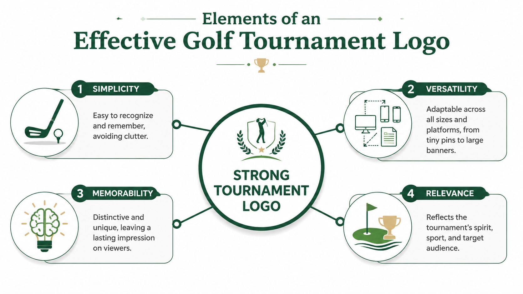
Simplicity usually wins
There's a reason so many established brands stay restrained. In research on the top global companies, 81.6% used two or fewer colors, and 77 of the top 250 brands used blue, based on logo design statistics compiled by Custom Neon. For tournament use, that matters because simple palettes and uncomplicated forms stay readable from a ball marker to a banner.
That doesn't mean every golf tournament should use blue. It means restraint tends to travel better than complexity. One main color, one supporting color, and a neutral is often enough.
Style and typography that age well
A lot of tournament logos date themselves by trying too hard to look premium. Metallic gradients, faux crests, crossed clubs, flags, shields, ribbons, and tiny golf scenes can all work in isolation. Pile them together and the mark starts looking like clip art from three redesigns ago.
What tends to work better:
A strong wordmark: If the event name matters most, let the type do the heavy lifting.
One supporting symbol: A flagstick, contour line, cup, or trophy silhouette can be enough.
Legible lettering: Choose type with open counters and sturdy weight so it survives embroidery and low-quality printing.
If you need examples of how local businesses think through visual positioning in a crowded market, this piece on brand identity for Phoenix businesses is useful because it focuses on fit and clarity rather than trend chasing.
Build the logo with sponsors in mind
Tournament organizers often approve a logo before thinking about the sponsor board. That's backwards. Your primary mark needs to leave room for other marks without turning the whole layout into a traffic jam.
A practical starting point is this table:
Use case | Best logo approach | What to avoid |
|---|---|---|
Welcome banner | Horizontal lockup with generous spacing | Tall stacked logo that forces sponsors too low |
Scorecard | Compact one-color version | Fine outlines and small decorative details |
Website header | Wide version with clean type | Badge-style logo that shrinks poorly |
Hat or polo | Simplified icon or short wordmark | Long event name with thin lettering |
The tournament logo should lead the page, not fight every sponsor for the same amount of attention.
That's the difference between a mark that looks nice in a proof and a mark that performs.
Designing for Sponsors and Co-Branding
Sponsors don't ruin tournament branding. Poor hierarchy does.
Most event materials fail because every logo is treated like the main logo. On a welcome sign, registration page, or printed program, your tournament logo should establish the event first. Sponsor marks support it. If you give everything equal visual weight, nobody wins.
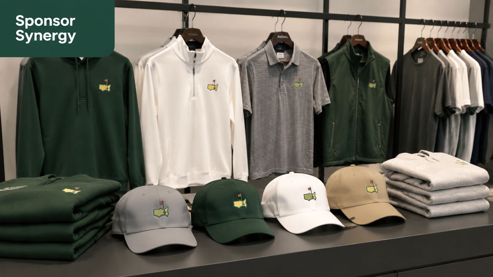
Use a hierarchy that people can scan
Start with a simple rule. The event logo gets the prime location and the most breathing room. Title sponsor placement comes next. Secondary sponsors should be grouped consistently, not scattered wherever space appears.
On real tournament pieces, these layout moves work:
Keep a safe zone: Leave empty space around the tournament logo so other marks don't crowd it.
Prepare horizontal and vertical versions: Some layouts need width, others need height.
Group sponsors by level: Presenting, supporting, hole sponsors, and in-kind partners shouldn't all sit in one undifferentiated row.
If you're planning broader sponsor visibility across the whole event, these golf outing sponsorship ideas are useful because they help you think beyond the logo wall and into actual sponsor placements players notice.
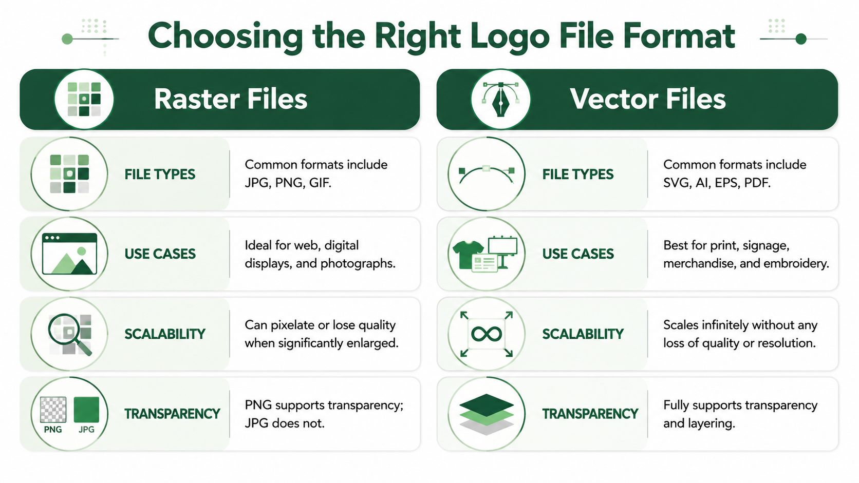
Make co-branding easier with better files
Organizers often get stuck. A printer asks for an EPS. A web person asks for a PNG. A sponsor wants an SVG. Someone sends a JPG pulled from social media, and quality falls apart.
The basic difference is simple:
File type | Best use | Limitation |
|---|---|---|
SVG | Websites, digital layouts, scalable graphics | Not every vendor wants it |
PNG | Web use, documents, transparent background needs | Can lose quality when enlarged |
EPS | Print shops, large-format production, embroidery vendors | Less convenient for everyday office use |
Vector files such as SVG and EPS scale cleanly. Raster files such as PNG and JPG are fixed images. If the logo will be enlarged on signage, apparel, or merchandise, the vendor should start from vector.
Keep one-color versions ready
Sponsors often submit logos in black, white, blue, red, and grayscale. Your event mark should be just as adaptable. If your tournament logo only works in full color with gradients and shadows, it will break the moment someone needs it on a hat, sleeve, or one-color sign panel.
A one-color logo isn't a fallback. It's a stress test.
That's especially true when your mark appears on merchandise, sponsor thank-you items, and labels from shops that don't print with the same precision as your designer's original mockup.
Preparing Your Logo Files for Every Scenario
Tournament day exposes every weak file decision you made weeks earlier.
At check-in, the printed scorecards may need a small black logo in one corner. On the first tee, the welcome sign needs a large sharp version. On phones, the event header needs a transparent file that doesn't sit inside a white rectangle. By the awards table, somebody wants to add the logo to a quick sponsor thank-you slide. If you only have one flattened image, every one of those jobs gets harder.
Start with vector, then test without color
A reliable workflow is to build the logo as a vector mark, simplify it, and make sure it works in black and white before you add color. That guidance comes straight from Logo Design Basics from Louisiana Tech University, which emphasizes vector construction, simplification, and black-and-white proofing so the mark remains legible in print and digital use.
That advice matters more in tournaments than in many other settings. A mark might appear embroidered on a cap, laser-printed on a cart sign, and shown on a mobile screen in the same event. If it only works in one environment, it isn't finished.
The simplest file package that actually works
Most organizers don't need a giant brand standards manual. They need a folder that prevents confusion.
Keep these ready:
Primary full-color logo in SVG and PNG
Black version in SVG and PNG
White reverse version in PNG
Print-ready EPS for vendors
Icon-only mark if your event uses one
A short note naming approved colors and fonts
If you work with decorators, apparel shops, or promotional vendors, a plain-English explanation of file differences helps. This DTF image format guide for custom printers is a practical reference because it shows when raster is acceptable and when vector is the safer choice.
Follow the logo through a tournament day
Think through the event like a checklist, not a design review.
At 7 a.m., the registration table uses a compact logo on tee sheets and scorecards. At 8 a.m., cart signage needs a version that still reads from a few paces away. Mid-round, a mobile leaderboard header needs a clean transparent file with no tiny ornament. After play, award slides and sponsor recap emails need a version that drops into documents without cleanup.
For printed specialty pieces, a custom illustration can sit alongside the tournament logo if the hierarchy is clear. A good example is how organizers use course art on premium items, and this guide to a custom golf course map shows how that kind of visual can complement event branding without replacing the main mark.
Send vendors the exact file they need. Don't send five random exports and hope they choose correctly.
That one habit prevents a lot of blurry signage and awkward last-minute redesigns.
Putting Your Tournament Logo to Work
A strong tournament logo proves itself in motion. Not in a presentation deck, and not in a design mockup with perfect lighting. It proves itself when players move through the event and keep seeing the same mark, clearly, in different contexts.
The easiest way to judge that is by running a cross-context legibility check. Designers recommend previewing the logo at tiny social avatar size and comparing it beside competitor-style marks to see whether it stays distinct, according to this cross-context logo review guidance. That's a useful standard for tournament branding because golf events live in crowded visual spaces. Sponsor grids, leaderboard headers, and printed handouts all compete for attention.
Where the logo earns its keep
On tournament day, each touchpoint asks something different from the same mark.
Check-in table: The logo should be identifiable instantly on printed pieces with no squinting.
Cart signs: Players need to recognize the event from a short distance, often in less-than-ideal light.
Digital scoring and leaderboards: The mark has to be crisp on phones and browsers, not just large monitors.
Bag tags and giveaways: Fine detail disappears quickly on small-format items.
If you're planning print pieces that sit on carts throughout the day, this guide to golf cart signs is useful because it connects branding decisions to the way players encounter those materials on course.
Consistency makes the event feel organized
Players may not remember your font choice, but they will remember whether the tournament felt polished. That feeling comes from repetition. The same logo on registration pages, scoring screens, signs, bag tags, and awards material tells players the event was built intentionally.
It also helps vendors and staff make better decisions. When the logo package is clear and the approved uses are obvious, nobody stretches the mark, swaps colors casually, or drops it into a box just to make it fit.
Use extras to support the logo, not replace it
Decals, giveaways, and sponsor items can extend the event brand if they use the main mark consistently. If you're producing carside decals, cooler stickers, or sponsor handouts, options like Custom Sticker Shop custom decals can be useful for durable event branding, but only if the underlying logo is already simple enough to reproduce cleanly.
If the mark disappears on the smallest item in your package, it's too complicated for the rest of the package too.
That's the broader point. A tournament logo shouldn't need ideal conditions. It should work under pressure, across surfaces, with sponsors nearby, on print and screens, all day long. When it does, the event feels bigger, cleaner, and more credible than one held together by mismatched files and rushed artwork.
A Lasting Signature for Your Event
The best tournament logo doesn't just look good in approval emails. It holds up when the tournament begins. It works on scorecards, signs, digital screens, merchandise, and sponsor materials without needing a redesign every time someone opens a new template.
That takes discipline more than creativity. Define the event's tone first. Keep the visual language simple. Build the logo to coexist with sponsors. Prepare the right files before vendors ask. Then use the mark the same way everywhere players and sponsors encounter the event.
When organizers get that right, the logo becomes more than a graphic. It becomes the event's signature. People recognize it, trust it, and remember it. Long after the last putt drops, that's the part of the tournament identity that stays with them.
If you want a smoother way to put your tournament branding into action across registrations, scorecards, cart signs, bag tags, and live leaderboards, Live Tourney gives golf event organizers a modern, app-free system to run professional events without the usual software friction.